Hey I'm doing a process post. Isn't It lovely that I'm not whining about movies?
Comic Con International places fan art submissions in their Souvenir Book each year corresponding to anniversaries of significant comics creators and characters.
My Submission: The 20th anniversery of Jeff Smith's Bone.
The Method: Ink drawing colored in photoshop. With several concepts and techniques (i.e. "everything that follows") lifted from James Gurney's tutorials and instructional materials. Be forewarned, I don't like color, and it scares me.
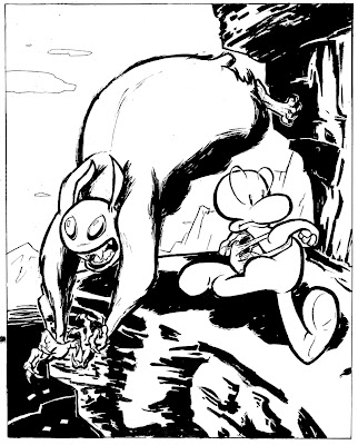
It's probably the cheapest shot in any painting demo to start with the line art and say "Here is the lineart I started with", as if Mr or Ms. famous guy scribbled down a masterpiece five minutes before the show.
I'm not a Haute-Schitt famous guy(well, not yet). This line art took me 8-12 hours from thumbnail to final inks to produce. I'm really slow and I don't have work-flow samples to post so you'll just have to live with that.
I'm not a Haute-Schitt famous guy(well, not yet). This line art took me 8-12 hours from thumbnail to final inks to produce. I'm really slow and I don't have work-flow samples to post so you'll just have to live with that.
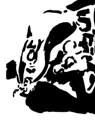
Here's a value study using only black and white, without any outlines. I did this as a separate layer to serve as more of a guide for value distribution, so as to avoid middle value mumbling.
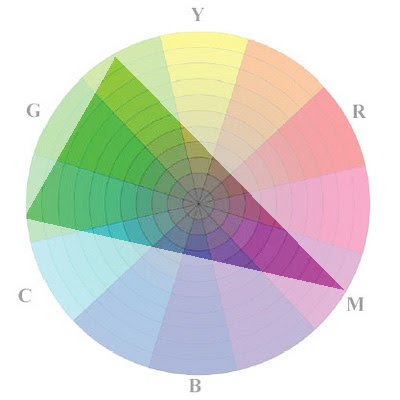
Gurney-lift #2: Determining a palette for the piece through a color wheel(in this case, a "Yurmby Wheel" consisting of both additive primaries and printers' ink primaries), color scheme ( split complimentary) and a gamut mask. In theory, everything outside the borders of the triangle is off limits, everything inside is okay for beautiful color harmony.
From that mask and wheel, I extrapolated the palette below.
From that mask and wheel, I extrapolated the palette below.
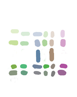
I f I were tech savvy, I'd save that as a swatch set, But I don't like the linear fashion that Photoshop organizes swatches in, which makes it difficult for me to switch between value and hue easily and intuitively as I would a real palette, so this is just another boring old layer, which I switched on and off to sample from. Also, I double-checked my darker tones to make sure there was no "K" (black ink) in their makeup. Black ink muddies colors on the printed page.
The gamut mask and the palette creation are my lifts from James Gurney's book "Color and Light", a pretty engrossing read.
The gamut mask and the palette creation are my lifts from James Gurney's book "Color and Light", a pretty engrossing read.
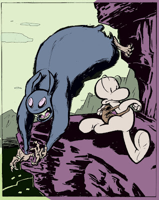
Here's the flats, another grossly overlooked step in famous-dude painter demos(and pretty downplayed, too). I think 80% of the colorists' work is in choosing flats: In which you have the color scheme and "natural" tone and hue of the forms. With flats, you can determine focus, separation of foreground, midground and background (which is why my rocks are purple, but the sky green), all before you lay down a single gradient.
You'll notice I didn't put any white in the flats either(explaining why Phone Bone is sort of pink). I was planning on using pure white, but for emphasis, like painters and stuff.
You'll notice I didn't put any white in the flats either(explaining why Phone Bone is sort of pink). I was planning on using pure white, but for emphasis, like painters and stuff.


Jeff Smith would be proud. Excellent capturing of his aesthetic.
ReplyDelete